67 INC
We all know that we mustn't judge books by their covers, but is that completely true? Surely book covers deserve some of that attention they seem to demand.
Cover art -- whether minimalist or extravagant, bold or subtle -- offers nothing short of a meeting between an advertisement of the book's qualities and an artistic interpretation of its contents. Even working within the constraints of a book cover template (including title and author, or, for a series, matching the design to a set aesthetic), the designer's creativity can shine through, encouraging you to grab this book, not that one, from the store display.
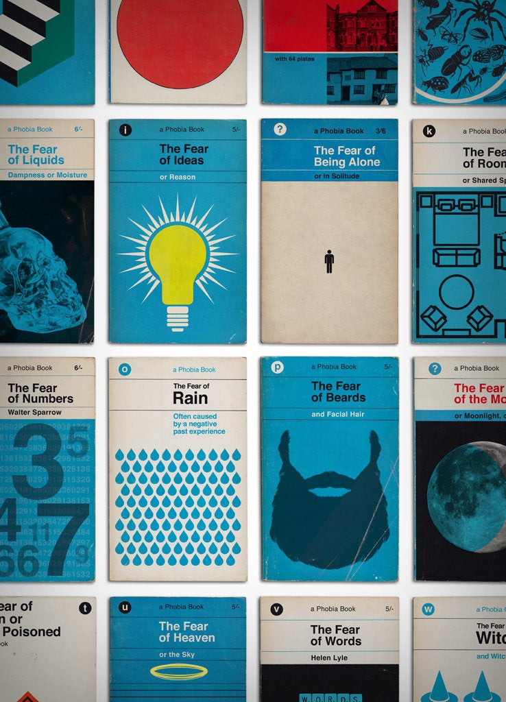
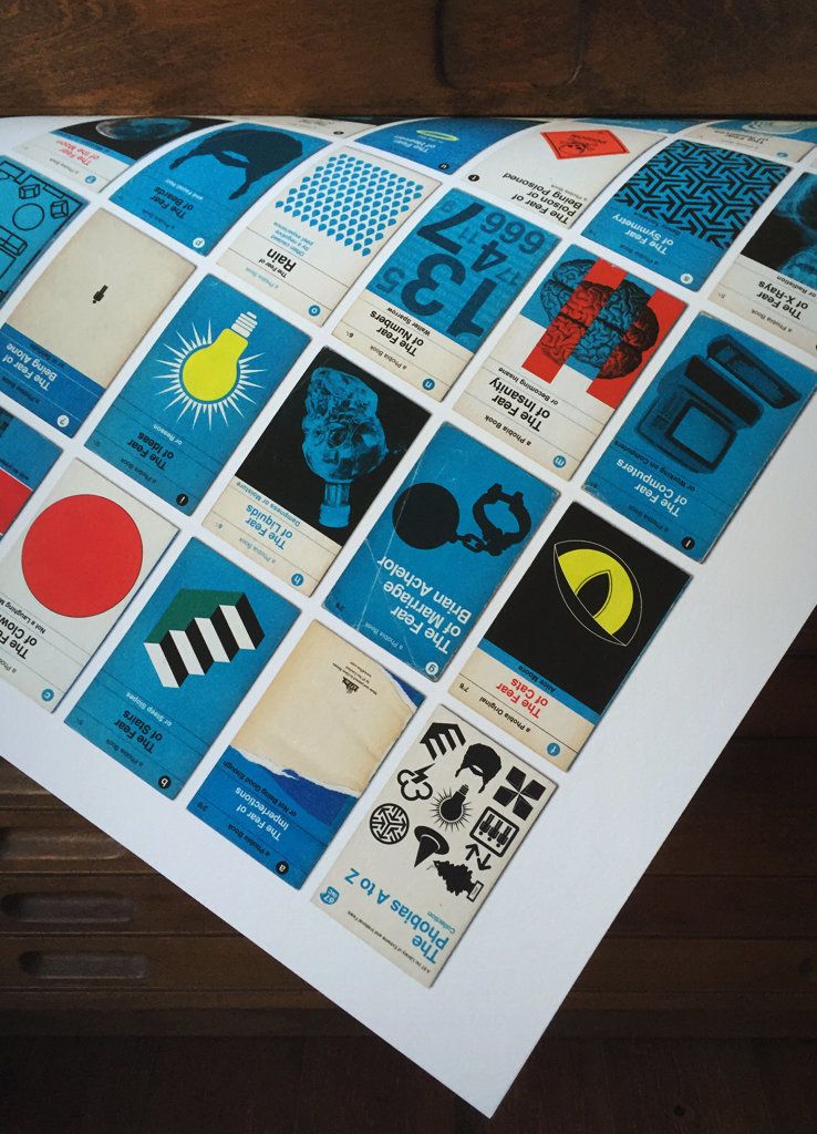
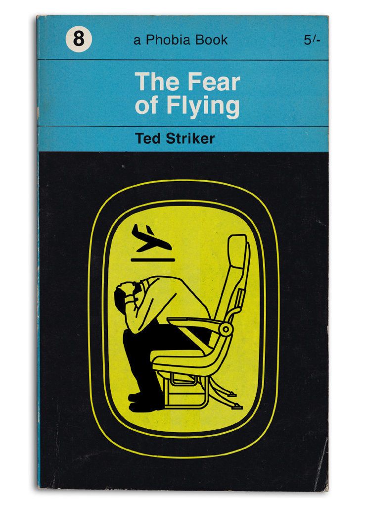
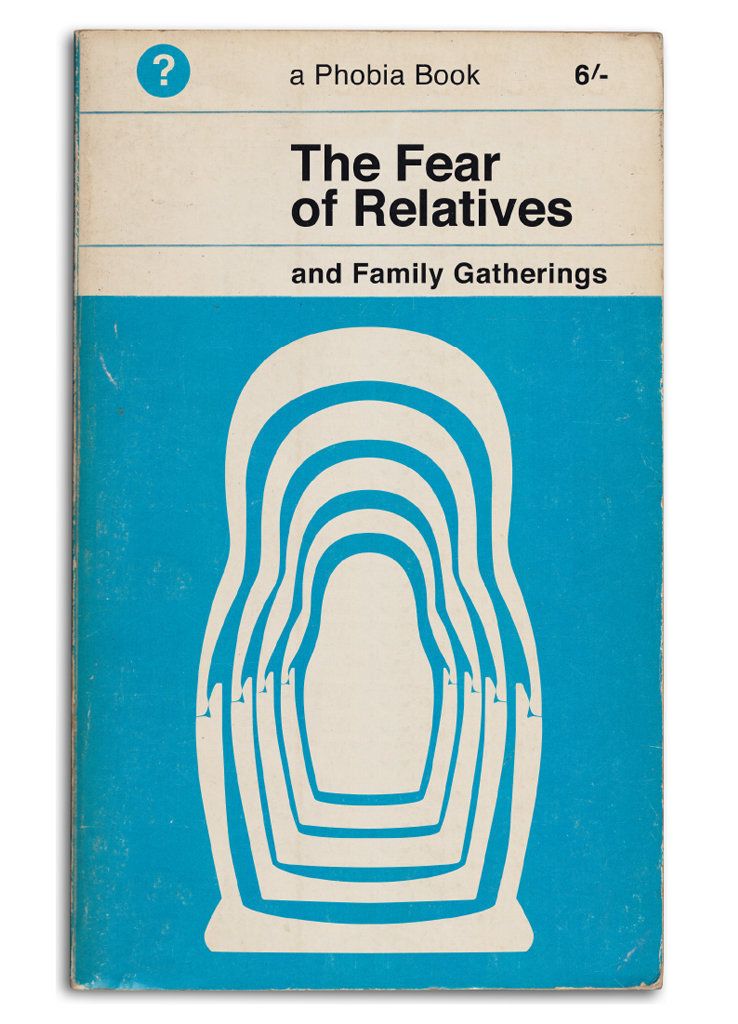
Simon Staines' simple, eye-catching posters, inspired by vintage book design aesthetics, plays with the iconography of covers to great effect. The designer behind 67 Inc recently came out with a new poster, "Phobias Book Covers A to Z," that represents 34 extreme fears with a book cover each, inspired by the look of 1960s vintage paperbacks.
 67 INC
Staines, who designs posters at 67 Inc alongside his day job working on motion graphics for blockbuster Hollywood films, told The Huffington Post in an email that he knows he's not alone in admiring the classic aesthetic of 1960s book covers. "Like many designers," he wrote, "I am drawn to the bold simplicity of this type of design, which were immediate and accessible often using just type or blocks of color and shapes."
His past prints have used trading cards as the foundational elements. "I have always been interested in collecting and collections," Staines explained. "A series of books was really a natural progression of the idea."
Why phobias specifically? He pointed out that for an A-to-Z concept, the general subject has to allow you to span the alphabet, and fortunately there are innumerable phobias. Plus, there are so many different fears in the world that the series could be deeply varied: "The beauty of phobias as a concept for a print was the wide ranging scope of subject matter you get to illustrate," he said.
Plus, if you pay close attention, there are delightful Easter eggs for the culturally versed: Some of the books have authors listed on the cover whose names can be recognized as characters who famously suffered from the titular phobias.
 67 INC
The print, which Staines created with a mix of hand drawing, photography, Photoshop, and other design software, captures fears of rain, relatives and rooms in iconic graphics that nonetheless look lightly worn-in. "I tried to make each cover look like a book you may have bought at a car boot sale or second-hand shop," he explained.
These slightly scuffed old paperbacks possess even greater romance in the era of ebooks and Twitter fiction; the print conjures an urge to rummage through a used bookstore or your grandparents' bookshelves, to see pages that have been turned over by other hands.
Perhaps this is a manifestation of the fear of computers, or logizomechanophobia -- or maybe books are just beautiful objects, no matter what they're about, as Staines' print aptly demonstrates.
 67 INC
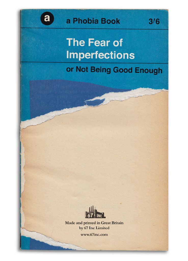 67 INC
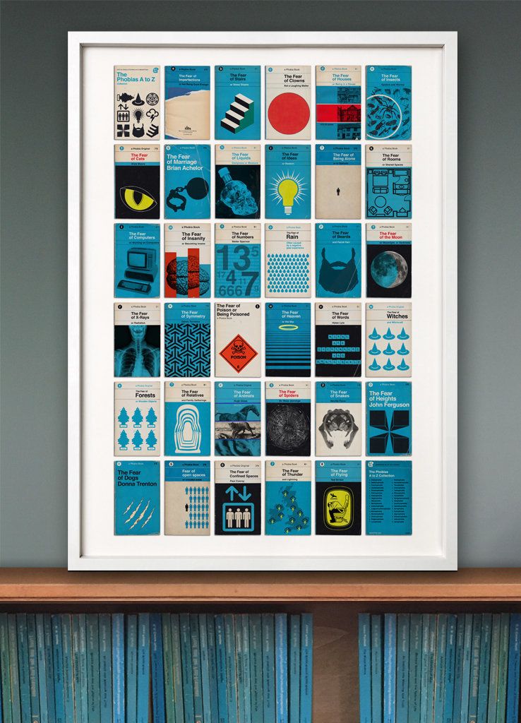 67 INCBy Claire fallon, the huffington post, february 23, 2016
No comments:
Post a Comment